Painting & drawing blog
COLOUR TERMS EXPLAINED
When you read up on painting techniques there are some key terms which are useful to understand, and which will help you to make more effective paint mixes. They include hue, shade, tint, tone, value, chroma, masstone and undertone. Some of the terms are specific to painting, and some derive from colour theory. Here I’ll explain how they are used within a fine art context.
HUE
The word ‘hue’ derives from an old English word for ‘form’ or ‘appearance’. It is often used interchangeably with the word ‘colour’ but in fact in painting theory its meaning is a little more specific.
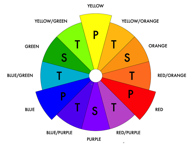
In painting, ‘hue’ refers to a ‘colour family’. More specifically, it refers to one of the twelve colour families within the colour wheel, which are comprised of the primary, secondary and tertiary colours.
The primary colours (marked above with ‘P’) are red, blue and yellow. The three secondary colours (marked above with ‘S’) of orange, purple and green can be achieved by mixing the primaries together (yellow + red = orange, red + blue = purple, blue + yellow = green) Lastly the six tertiary colours (marked above with ‘T’) are made by mixing the primary and secondary colours which are closest together on the wheel, achieving the colours of yellow/green, yellow/orange, red/orange, red/purple, blue/purple and blue/green.
We use the word hue to describe both the colour ‘families’ that form the twelve colour wheel colours, and any particular colour’s relationship to these families. For instance, we could say that the different red colours in your paint box such as Scarlet and Burgundy are ‘red hues’ because they are colours in which red is dominant, as opposed to either blue or yellow. Olive green and Emerald green could both be described as ‘hues’ of green, whilst Turquoise Blue could be called a ‘blue/green hue’.
It wouldn’t be accurate to talk about something being a ‘Turquoise hue’ or an ‘Olive hue’ but colloquially, people tend to do this. More accurately, Olive should be described as a ‘yellow/green hue’, where green predominates.
Pure black, white and grey are not hues, and the word in its truest context refers to only a ‘pure’ colour that is not a ‘tint’ or a ‘shade’ (meaning that it has no white or black in it). Nor is a brown considered a hue, because you achieve it by mixing all three primary colours together.
‘Hue colours’ – a different meaning
There’s a related but different and more practical use of the word hue in fine art. A ‘hue mixture’ is a paint colour that is created to imitate a traditional pigment that may be now obsolete due to toxicity or environmental concerns, or may simply be very expensive.
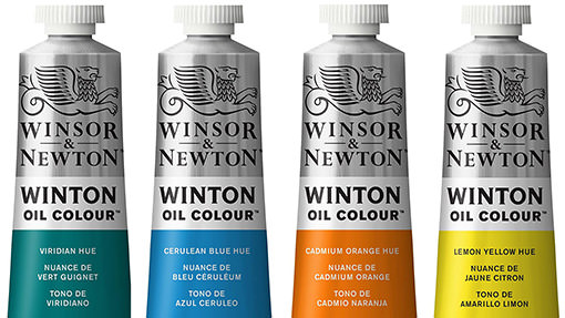
The hue colour is achieved either by substituting an alternative pigment or by blending several pigments together to approximate the original colour. For example, ‘Cadmium Orange Hue’ is sold as a much cheaper alternative colour to ‘Cadmium Orange’ but contains no actual cadmium pigment within it. Hue colours are commonly found within student grade paint ranges, providing a cheaper alternative to the most expensive paints.
SHADE, TINT AND TONE
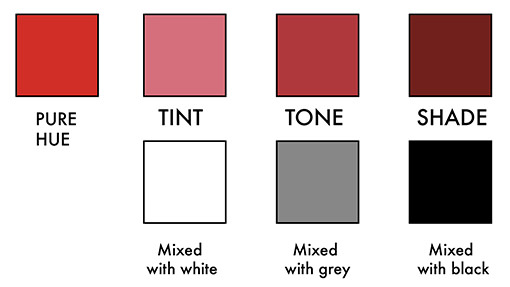
These terms describe pure hue colours which have been mixed with either white, black or grey.
Shade
In paint colour terms, the shade describes the extent to which a pure colour (a hue) has been mixed with some black, to increase its darkness.
Tint/ Tinting strength
A tint is the name given to a pure colour which has been mixed with white to lighten it. Like a shade, tinting has the effect of de-saturating a colour, and will often turn it to a pastel.
The ‘tinting strength’ of a colour is defined as its ability to affect another colour that it is mixed with. Tinting strength is typically assessed by mixing a paint with some titanium pigment. Pigments vary greatly in their tinting strength. Traditional, inorganic pigments made from metallic elements tend to have a weak tinting strength (with some exceptions, such as cadmiums). The strongest tinters are the modern synthetic organic pigments such as phalocyanines and quinacridones.
Tone
The tone of a colour describes the extent to which it has been mixed with both some black and some white. Adding grey changes a colour’s ‘tonal value’ and dulls it down.
VALUE AND CHROMA
These two definitions have a close relationship but are not identical.
Value
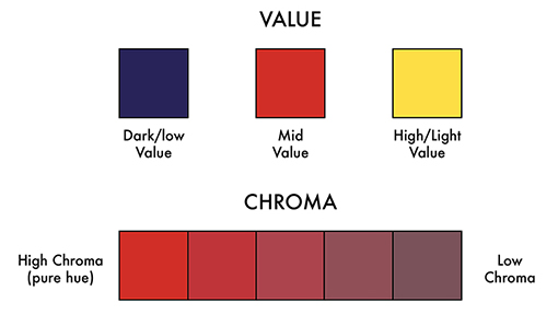
The value of a colour describes its relative lightness or darkness. This has nothing to do with the addition of any white or black. Instead it describes the lightness or darkness of a colour relative to a scale that would place pure white at one end and pure black at another, with every grade of grey in between. For example, yellow would have a lighter value than a navy blue because it is closer to the white end of a gradated light/dark scale whilst navy is closer to the black end. Pale, light colours are said to be ‘high’ in value whilst darker colours are described as being ‘low’ in value.
Chroma
Chroma describes the intensity of colour, defined by how much pure hue is present, and how much white and/or black has been added. In painting terms this word is more or less identical to ‘saturation’. A ‘high chroma’ colour will have little black or white in it or none at all (a completely pure hue) whilst a ‘low chroma’ colour would be a shade, tint or tone mixed with lots of black or white. Although a high chroma colour will be very bright, chroma isn’t considered exactly the same as ‘brightness’ because the latter involves both chroma and value. Nor is it technically the same thing as ‘luminosity’, although high chroma colours will look the most luminous.
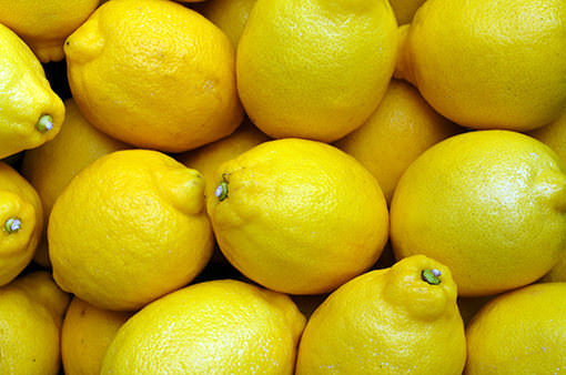
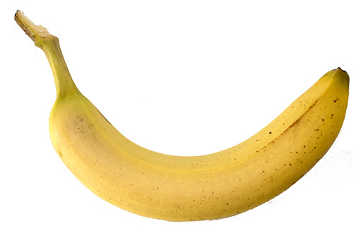
The example commonly given to illustrate ‘chroma’ is that of a lemon and a banana. The colour of a lemon has a lighter value than that of a banana because it would be a little closer to pure white on a gradated ‘value’ scale, whilst a banana yellow is a bit darker. However, a lemon yellow nonetheless has a higher chroma than a banana yellow, because it is such a strong and intense yellow whilst the colour of a banana is more muted.
To grasp the distinction it can be helpful to imagine yourself painting both fruits. If you were to paint a lemon in watercolour you’d probably use pure yellow paint, diluted only with water. However to approximate the colour of a banana in paint you’d probably mix that yellow a little white and maybe also a drop of black, to tone down and mute the yellow.
MASSTONE AND UNDERTONE, AND COLOUR BIAS
Understanding how paints behave in ‘masstone’ and ‘undertone’ is very useful in learning how to mix colours effectively. To grasp their meaning, it’s first helpful to recall how the eye actually sees individual colours. As an example, an object will appear to be a true red in colour when it absorbs all non-red spectral light, and only red light bounces off it. This gives the object its red appearance.
MASSTONE
When you squeeze paint straight out of a tube it is thick and opaque, with no transparency. You therefore see the colour at its strongest and truest, and this is called a ‘masstone’. For example if this undiluted paint is red, then red light will bounce straight off it and none will penetrate it to reflect off the substrate below. Paint applied in a masstone should match the colour on the label, and will appear just as you expect to see it.
UNDERTONE
When a paint colour has some transparency because you’ve diluted it or have scraped it very thinly over paper or canvas, something different happens to the light that hits it. Instead of bouncing straight off as it would do with an opaque masstone, light can filter all the way down to the substrate and bounce back through the thin colour film that you’ve applied. When this happens you may see slightly different coloured ‘undertones’ being revealed. This is not – or not simply – because paint colours are so often created from more than one pigment. It can happen with a ‘single pigment’ colour too.
Undertones occur because no paint made from particles of pigment can have the same purity as true spectral light. Instead, every paint colour will lean slightly in one direction or the other towards a secondary colour adjacent to it on the colour wheel. A red paint may have ‘purple/blue’ undertones because it leans more towards blue, or it may have ‘orange/yellow’ undertones if it leans more in the other direction. The bias happens because the non-red colours within the paint are not being absorbed at identical rates. If a red pigment absorbs yellow light quicker than blue light, then the red colour will ‘lean’ towards blue.
When a paint pigment leans one particular direction, this is known as a ‘colour bias’. If you’ve ever opened your new paint tube, diluted some paint and been surprised to see it looking quite different to the swatch printed on the label it’s probably because you’re seeing the colour bias being revealed. A ‘concealed’ colour can emerge that looks a little different in hue to the undiluted paint, and not just because it’s been thinned and is therefore lighter. Sometimes these undertone colours are welcome, sometimes not.
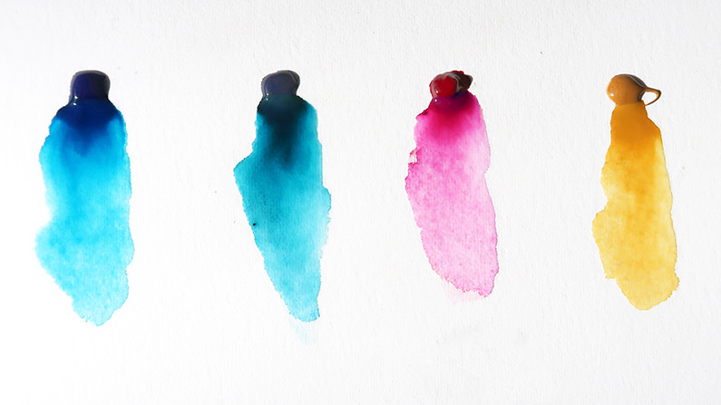
It helps to know which way a colour ‘leans’ when you are mixing up some paint. For example if you are mixing up a green colour using blue and yellow paint and the blue colour you are using has a purple/red bias, this is going to give you a muddy mixture. Using a blue colour with a green/yellow bias instead will work much better and give you a brighter, cleaner green. If the yellow that you are using has a green/blue bias rather than an orange/red one, then the colour will be clearer still. Colour bias is often described in terms of a ‘cool’ or ‘warm’ undertone. A blue that leans towards purple and red would be said to have a warm undertone, whilst one that leans towards green and yellow would be said to be cool.
Depending on the pigment used to make your paint, you may see more or less of this effect when you dilute your paint. With many of the opaque inorganic pigments such as cadmiums and cobalts, the undertone will be very similar to the mass tone and you won’t see a marked difference between the two. The more modern modern ‘synthetic organic’ pigments which have a very fine particle size and a greater degree of transparency are the most likely to reveal a strong bias towards another colour.
© Article rights reserved. View Anna Bregman’s pencil portraits drawings here
CATEGORIES
DRAWING PEOPLE
DRAWING ANIMALS
DRAWING MATERIALS
OIL PAINTING
WATERCOLOUR
PAINTING MATERIALS
FRAMING

