Drawing & Painting blog
IN PRAISE OF GOUACHE
A beginners’ guide
There are no paid product links in this article
I think of gouache as the ‘dark horse’ of the paint world. Most people have heard of it but very few really know what it is and fewer still have tried it, despite it being an extremely easy, effective and versatile medium to work in.
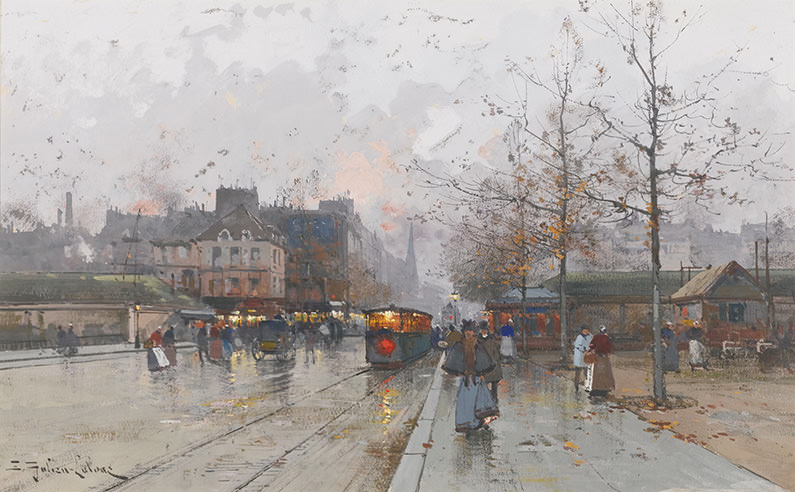
Eugène Galien-Laloue (1854-1941) PORTE DE CHATILLON, PARIS. Gouache, watercolour and pencil on paper
CC0 1.0 Public Domain
It wasn’t always this way. For centuries gouache was very popular and it enjoyed a resurgence during the modernist era when artists began rejecting chiaroscuro (representing forms with light and shade) and started using strong flat colour, for which gouache was ideally suited. The list of artists who most frequently worked in the medium include Moreau, Degas, Redon, Matisse, Kokoschka, Schiele, Klee, Malevich, and Chagall.
Matisse’s wonderful ‘Cut-outs’ were painted in gouache. Other twentieth century artists who often worked in the medium include Alexander Calder, Jackson Pollock, Agnes Martin, Sol LeWitt, and Bridget Riley. Today gouache’s popularity has waned and it’s rare to find a modern artist who uses it, Anish Kapoor being one notable exception.
I might never have come across gouache except that I once studied theatre design and worked for some time as a theatrical model maker, where we used gouache to paint tiny little models of our theatre sets. With its opaque velvety finish that shows no brush strokes, gouache has often been the paint of choice for theatre, costume and textile designers, as well as illustrators and animators. It’s very easy to use because because it’s water soluble, so you can dilute and clean it up with water. These days however it has largely been replaced within the design industries with something that’s even quicker and easier: Adobe Photoshop.
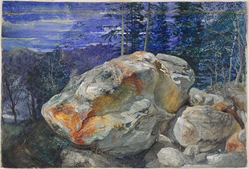
John Ruskin, FRAGMENT OF THE ALPS (BOULDER AT CHAMONIX), 1854-1856, Watercolour & gouache over graphite on paper
Credit: Harvard Art Museums/Fogg Museum, Gift of Samuel Sachs
With the decline within both fine art and design, gouache now has a tiny percentage of the paint market and is regarded as something of an oddity and an unusual choice of medium to work in. This is such a shame because not only is it great for beginners – the technique is arguably easier than either watercolour, oils or acrylics, and – but it’s also very well suited to the type of bright, bold colours and mixed media techniques often favoured by contemporary artists.
Artists of the past have also appreciated all of these qualities. This painting by John Ruskin combines both watercolour and gouache paint in a way that artists have been doing for centuries: giving a strength and solidity to certain colours and forms that would be hard to achieve with transparent watercolour alone.
Just what exactly is gouache?
I discovered that I’d been pronouncing the word incorrectly for years and had been Anglicizing it to ‘goo-ash’ whereas the correct pronunciation is something like ‘gwash’. The word comes from the Italian word aguazzo which means ‘mud’ and derives from gouache’s wet and opaque appearance. Gouache is often called ‘opaque watercolour’ because both use the same gum arabic medium to bind their pigments. However gouache isn’t transparent like watercolour and provides richer and more saturated colour.
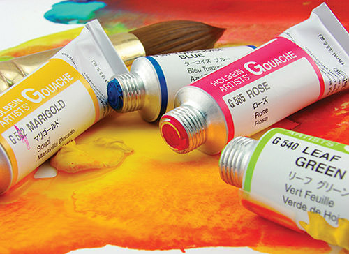
Both gouache and watercolour dry to a matt finish that can be ‘re-activated’ when water is applied to it. This means that unlike with oil or acrylic paint you can re-blend your paint and soften edges.
Some history
Opaque water-based paint has been used in continental Europe at least as far back as the time of Albrecht Dürer. Prior to the eighteenth century it would have been known as ‘bodycolour’ which denoted any opaque paint made from a heavy percentage of pigment and a glue size binder, usually with the addition of some kind of chalk or whitening pigment. Historically and still now, the terms ‘gouache’ and ‘bodycolour’ are often used interchangeably.

CC0 1.0 Public Domain
By the eighteenth century in France, ‘gouache’ was being used to describe a bodycolour made with gum arabic as its specific binding agent, plus some form of whitening pigment. These days pre-mixed gouache in tubes also contains additives such as glycerin or dextrin which improve the adhesion and flexibility of the paint layer. These are referred to as ‘moisturisers’ or ‘plasticisers’.
How gouache paint is made
With gouache you get a paint layer that’s thicker and heavier than watercolour and completely covers the surface you are working on, unless you water it down considerably. There are different ways that paint companies can achieve these particular qualities
- The pigments are more coarsely ground than with watercolour paint, making them less transparent when applied. Because of this opacity you can paint with gouache onto wooden board or cardboard, as well as onto paper. Technically you could paint onto canvas too, although a pre-primed, gessoed canvas probably wouldn’t accept the gouache paint well.
- The ratio of pigment to gum arabic binder is higher with gouache than with watercolour paint. This makes the colour very saturated and again, more opaque.
- A white substance such a chalk or titanium is usually (but not always) added to the coloured pigments making up each colour. Coloured watercolour paints in contrast will never contain any white, although most sets of watercolours will come with a tube of ‘Chinese White’ for painting highlights. If you were to add some of this white to your other watercolours you would effectively have created a primitive form of gouache – although you’d likely get a chalky and unsatisfactory effect.
The better gouache ranges try to achieve their opacity largely through a heavier pigment load, rather than relying on the addition of a lot of white pigment. The use of a lot of whitening agents distinguishes a cheap, student grade range. Daler-Rowney’s Designer’s Gouache range for example, adds calcium carbonate (chalk) to most of their colours and suffers from a chalky look as a result.
In contrast the well regarded Japanese company Holbein and some other paint companies such as M Graham actually use no whitening ingredients at all and achieve their opacity through a heavy pigment weight, the selection of more naturally opaque pigments, and a moisturiser. I haven’t tried M Graham paints, but I have found that the Holbein gouache is slightly less opaque than other brands due to the omission of any white pigment. However you could always mix in a tiny bit of white yourself if you want to create more opacity.
Winsor & Newton’s famous Designer’s Gouache range has been manufactured since 1935 and was the first range of high quality, pre-tubed gouache produced for designers. W &N’s approach is to use more opaque pigments as much as possible, but also to use a minimal amount of chalk or some white pigments such as titanium where needed. This balance is typically sought by manufacturers of professional grade gouache, because trying to create an opaque paint from the most transparent pigments – particularly modern synthetic ones – is very difficult.
A new product that has appeared on the market recently is Korean company Shin Han’s Shin Han Pass range which they describe as ‘watercolour and gouache hybrid paint’. The marketing description notes that the paint is fully dilutable, so that you can either use it thickly like a gouache or water it down like a transparent watercolour. As far as I can tell this paint has exactly the same type of formulation as the Holbein or M Graham ranges, which also contain no white pigment or chalk. Possibly however it may also contain more finely ground pigment particles, to make it closer to a transparent watercolour paint.
How is painting with gouache different to painting with watercolour?
- You can cover over areas of paint with a new layer. This isn’t really possible with watercolour where you can paint washes on top of each other, but not in a way that hides the layer beneath.
- Because it is thicker, gouache isn’t absorbed into the paper in the same way as watercolour, but will instead sit on the paper surface. Therefore you can’t create those textured, watery effects characteristic of watercolour washes. Watercolour paper is an ideal surface for painting with gouache, but works best with a smooth, ‘hot-pressed’ surface rather than a grainy paper designed to encourage textural effects.
- Although gouache won’t go as transparent as watercolour you can still dilute it to create a degree of transparency. Ranges without any white pigment such as those we’ve mentioned above by Holbein, M Graham or Shin Han, can be successfully thinned the most. Gouache can be incredibly vibrant when applied thinly with just a little added water to loosen the paint, allowing some of the bright paper surface to reflect through it. This painting by Paul Klee is a good example.
- Gouache is opaque enough to be able to paint on tinted paper or card, like this beautifully sensitive portrait by Toulouse-Lautrec. This is very different to watercolour painting on white paper, where you allow the blank paper to represent your lightest tones and highlights. When working in gouache on a tinted paper you can instead allow the paper’s colour to represent your mid tones, and apply your lighter tones with opaque pale paint. This can give a depth and atmosphere that can work well for representing indoor light, or for darker outdoor conditions.
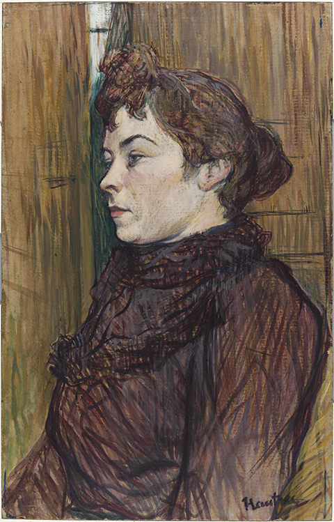
Credit: Harvard Art Museums/Fogg Museum, Bequest of Annie Swan Coburn
- You can’t employ a ‘wet on wet’ watercolour technique with gouache, adding more paint to a wash that’s not yet dry. With gouache you must let a first layer fully dry before adding a second layer. Be wary of applying multiple layers of very thick gouache, because it may start to crack. If you want to paint more thickly, there are now some ‘watercolour mediums’ such as Winsor & Newton’s Aquapasto which is a gel you can add to either watercolour or gouache paint to give it a thicker body. However this would still be better applied in a limited number of layers.
- Sable or synthetic watercolour brushes are suitable for use with gouache. However if you are using quite thick and undiluted paint this may be easier to manipulate with synthetic brushes designed for acrylic paint. You can find more information on different brush types here.
- Colours may appear slightly lighter as the paint dries. This is something you quickly get used to and accommodate for.
Which mediums can you combine with gouache?
Gouache is fantastic when used in ‘mixed media’ alongside graphite pencil, pastel, watercolour, ink, or even screenprinting. Artists have combined it in any number of ways: Henri de Toulouse-Lautrec mixed it with thinned oil and charcoal, Edgar Degas with pastel. Egon Schiele used it with pencil and watercolour whilst Anish Kapoor mixes it with acrylic paint. Because it’s flat and matt you can use gouache as a base colour and then work on top of it in another medium. Alternatively if you thin it down enough you can apply it on top of pencil or ink, allowing these marks to remain visible beneath.
This work by JMW Turner exemplifies the effects you can achieve with by combining gouache with watercolour. Turner has worked on a blue tinted paper to suggest a darkening sky, late in the day. On top he’s applied washes of yellow watercolour to depict thin clouds, still just about lit by a sinking sun. The yellow in these transparent washes vibrates against the blue of the paper to create that almost greenish light effect you sometimes get as a bright sun sets and night has almost fallen.
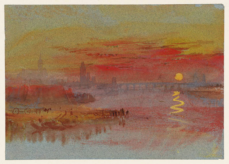
Joseph Mallord William Turner, THE SCARLET SUNSET, 1830-40, Watercolour and gouache on paper
© Estate of Turner, Photo © Tate CC-BY-NC-ND 3.0 (Unported)
Turner has then used gouache in strong bold colours to depict the heavier red-tinted clouds, the richly yellow sun and its reflection on the water with an intensity that you’d struggle to achieve in watercolour, particularly on a tinted paper. For the bluish paint used to depict the bridge and the silhouetted buildings, Turner uses a gouache of ultramarine strengthened with white, so that it remains visible under further washes of transparent red watercolour.
CC0 1.0 Public Domain, Credit: The Art Institute of Chicago
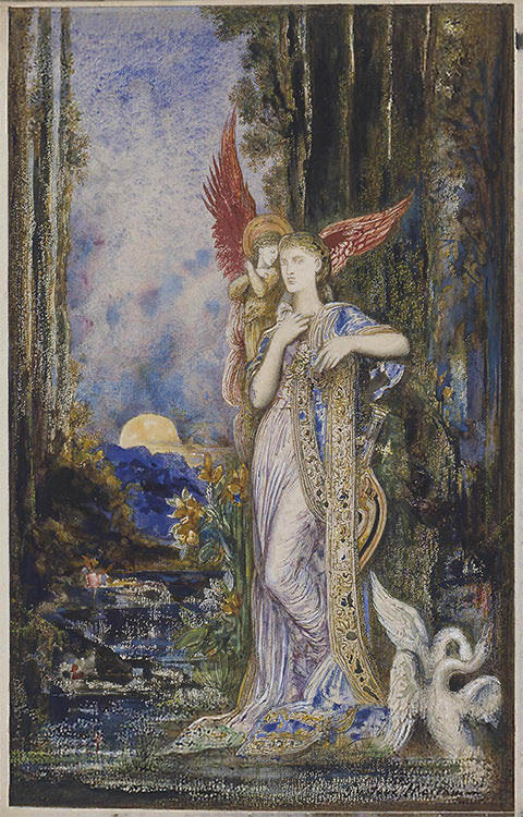
Gouache was very popular with artists associated with the Expressionist, Pre Raphaelite, and Symbolist movements which delighted in using very rich colour. This lovely work by the late-nineteenth century Symbolist painter Gustave Moreau uses gouache to create strong rich tones, whilst combining it with watercolour, pen and blue ink to create a detailed and illustrative effect.
One artist who delighted in the particular qualities of gouache was the Belle Epoque painter Eugène Galien-Laloue who painted ‘Porte de Chatillon’ at the top of this article. Galien-Laloue frequently worked entirely in gouache, over a pencil sketch. His father was a theatre designer and would likely have worked in gouache, explaining his son’s proficiency in the medium.
Sometimes referred to as an ‘illustrator’ on account of his choice of paint and his unchallenging subject matter, Galien-Laloue painted hugely accomplished street scenes of a brightly illuminated Paris. He worked onto warmly tinted paper to give his paintings an atmospheric light and overall tonal consistency, favouring the depiction of dark or overcast days and skilfully depicting clouds, rain, snow, and the effects of wind.

CC0 1.0 Public Domain
In ‘Place de la Bastille’ Galien-Laloue deliberately exploits the potential chalkiness of gouache, using runny but still opaque washes of pale paint over the warmly tinted light brown paper to suggest clouds heavy with snow. In places he’s allowed it to pool on the paper, drying with watermarks to represent the texture of snow clouds. He’s used more watered down paint for the wet sleet lying on the pavements and road. Unlike a watercolour wash that would sink straight into the paper, the wet gouache pools on the surface like real puddles.
Galien-Laloue has then worked on top of these layers, dragging over brown paint with a dry brush to suggest the reflections of the buildings, people and cars on the wet ground. He uses similarly dry paint to indicate branches and ironwork details with the flick of a tiny brush. With much thicker paint he then picks out the heavy white snow sitting on ledges, and the bright artificial lights. The combined use of both watery and opaque paint creates a work that just couldn’t have been produced in any other medium.
Although Galien-Laloue wasn’t radical in his subject matter with his brightly lit street scenes, it’s easy to forget what a novelty the new artificial illumination of Paris would have seemed at the time and it’s this excitement that he was seeking to capture. If his work is a bit too ‘cheery’ for you however I can recommend a less well-known Belle Epoque painter who also excelled in his use of gouache: the French-Italian Luigi Loir. Although Loir also worked in oils, he frequently used gouache either by itself or in combination with watercolour and always to beautiful effect.

CC0 1.0 Public Domain
Loir’s palette was more restrained than Galien-Laloue’s but he employed a similar technique, working onto a tinted paper to set a warm dark undertone and creating heavy skies of chalky paint. Loir used a plethora of different types of mark-making including scratching into wet paint with a pencil or the end of a brush to define architectural details. Here he also scratches tramlines into the slippery wet road, painted with pale opaque washes.
The building to the right of the image has been painted with thin dry paint that allows the paper grain to show through and stand for the texture of the shadowed stone. In the windows, watery white washes suggest some curtains whilst bright yellow dabs of very thick paint depict the gas lights inside. Loir’s favourite period was dusk, when the darkening skies could be contrasted with the cozy artificial lighting that now lit up Paris.
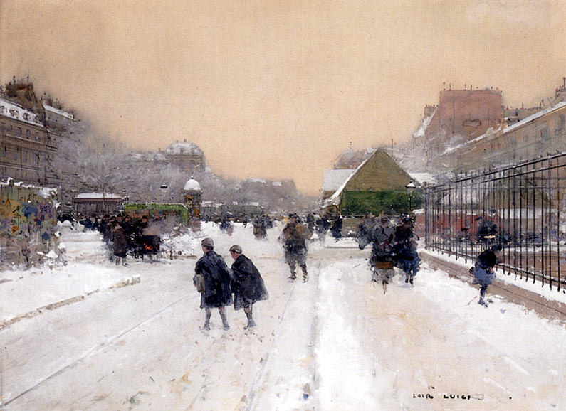
In Paris Sur La Neige Loir uses dry thin paint scumbled over warm brown paper to depict the buildings receding from us as the far end of the street, whilst thick loose white paint stands for the snow in the foreground. It’s this contrast between the opacity and texture of the gouache in different areas that is so effective in creating the very specific light created by snowy weather conditions.
Which gouache paint range should you buy?
Which paint range you choose may depend in part on what sort of work you want to do with it. If you want to avoid any hint of chalkiness then go for a brand with no added whiteners, such as Holbein, M Graham or Shin Han (although watch out for some ‘fugitive’ colours in the Shin Han paint if you are concerned for longterm lightfastness). However if you want a range with that hint of chalkiness that Galien-Laloue and Loir exploited so successfully, or you just want a fully opaque range of colours with no transparency, then look for a good professional grade paint that has some added white.
Winsor & Newton’s classic Designer’s Gouache is a very decent range, and Schminke are a good paint company that make a paint called Horodam Gouache that’s available in the UK – however don’t confuse it with their Akademie student range. If at all possible I’d suggest avoiding cheaper brands because the heavy chalk fillers will give you duller colours. Both Daler-Rowney’s Designer’s Gouache and Aquafine Gouache ranges are too chalky.
Royal Talens make their mid-priced gouache range with a dextrin binder instead of a gum arabic. Dextrin is often used as a cheaper alternative to gum arabic and is the binder used in cheap poster paint, but Royal Talens market it here as a more ‘traditional’ binder which they say gives a natural opacity that affords less need for fillers. I haven’t tried this range so can’t comment on its quality but many people really like it.
‘Acrylic Gouache’ paints
A brief mention now about the new ‘acrylic gouache’ paints now offered by various manufacturers including Japanese brands Holbein and Turner and US company Liquitex. Acrylic gouache is largely just a matt version of an acrylic paint. It dries a little more slowly, but like normal acrylic it’s entirely water resistant when dry because the binder is a straightforward acrylic polymer.

Acrylic gouache provides the usual benefits of acrylic paint such as the ability to paint thicker layers without cracking, because the acrylic polymer binder brings great flexibility to the paint layers. You can also easily paint onto canvas with it, or to virtually any other surface. It does have a few hybrid qualities, being made with larger pigment particles, a high pigment load and often the addition of some white pigment. In contrast to regular acrylic paints of which around half the colours will be transparent, acrylic gouache colours will all be strong and opaque. This uniformity and the bright saturated colours of acrylic gouache have made them popular with designers in various fields.
© Anna Bregman. Hand drawn portraits from photos
CATEGORIES
DRAWING PEOPLE
DRAWING ANIMALS
DRAWING MATERIALS
OIL PAINTING
WATERCOLOUR
PAINTING MATERIALS
FRAMING

